|
|
Post by -- x panorama on Jun 28, 2007 13:45:58 GMT -5
That's fine, don't worry about it.
[grins] My orders are flooding in now - me happy!
|
|
|
|
Post by » Sophie on Jul 1, 2007 11:40:59 GMT -5
goodie for you
|
|
|
|
Post by -- x panorama on Jul 2, 2007 11:53:12 GMT -5
Right, ok. Now, i need you to take the friesan image, and put it on a nice purdyful background (perhaps a cliff overlooking the sea, stormyish?) and don't add any effects just yet. then, again save it as a .pspimage and a .jpg. Ok? Then we'll see what we can do.
Also, are you interested in taking an exam? I reckon you could pass bronze/silver easily.
|
|
|
|
Post by » Sophie on Jul 2, 2007 16:05:45 GMT -5
yep yep would be interested in taking an exam oh and will get on with the image asap
|
|
|
|
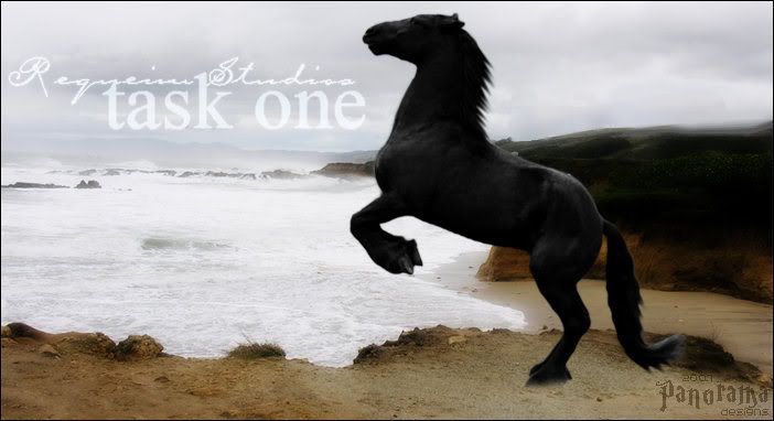
Post by » Sophie on Jul 3, 2007 10:59:19 GMT -5
Okay so heres the untouched image  |
|
|
|
Post by -- x panorama on Jul 3, 2007 13:41:47 GMT -5
Ok, well I personally would move the horse more to the right, so he's more kinda looking out to sea. Then I'd add text, perhaps in a light blue in Carpenter ICG, overlay or screen the tet, and slant it so it's going down towards the left, and perhaps add a tiny bit of glow in the same colour as the text. It also needs to be smaller, I'd resize it to about 70/75% - maybe smaller.
Also, what level exam would you like to do? I think we'd be best starting you off on bronze, then trying silver, and perhaps gold!
|
|
|
|
Post by » Sophie on Jul 5, 2007 1:44:20 GMT -5
bronze would be a good starting point and i will do the image when i get home from school
|
|
|
|
Post by -- x panorama on Jul 5, 2007 7:40:51 GMT -5
Ok, that's great. I'll writeup the test for you when I get home from school too!
|
|
|
|
Post by » Sophie on Jul 5, 2007 13:20:36 GMT -5
 there we go ^^ |
|
|
|
Post by -- x panorama on Jul 6, 2007 12:19:35 GMT -5
 -- x i154.photobucket.com/albums/s277/shandesigns/RStaskSophie01.jpg x -- What I did here was; -- x I added the text in the font Carpenter ICG and Times New Roman, in colour #c0d0e0 - a very light blue. -- x I then addded a glow - blur 3 - in the same colour. -- x Then I put my copyright ont he image. It's a good idea to make your's into a brush so you can just slap it on quickly. I also had to remove the text you'd put on it using the object remover tool, but never mind that. So can you see now what would be better? I'm putting together your test now - you will need to practise - 'revise' if you will ; -- x Cutting/Smudging. -- x Using text creativley - fonts, effects, colours, etc. -- x Applying textures/brushes. -- x Applying all this to a picture. I will PM you the test, and i need you to complete it as quickly as you possibly can. Ok? |
|
|
|
Post by -- x panorama on Jul 6, 2007 12:52:17 GMT -5
I have sent you the test for bronze.. Thanks!
|
|
